SAAS
Design system
WorkFlex – Establishing single source of truth and reduce execution time by 40%
When I joined WorkFlex, I stepped into a platform that had grown quickly but without a unified design or front-end foundation. Every feature team had its own way of building components. The product relied on a mix of Tailwind and raw CSS overrides, multiple table implementations, three separate icon libraries, and custom components that looked and behaved differently across modules.
There were no tokens, no documentation, and no single source of truth. This inconsistency created regressions, slowed development, and weakened the overall product experience. My mandate as Principal Product Designer was clear: establish a unified Design System that would scale across engineering, reduce delivery time, and create a consistent, accessible experience across the WorkFlex platform.

Timeline
2025
Platform:
Web + Mobile
Team
5 Engineers, Me
Role
Staff Product Designer
The goal
The goal of this initiative was to build the first unified, scalable Design System for WorkFlex in order to eliminate UI inconsistencies, reduce engineering effort, and enable the product to scale efficiently.
My Role
Directed the vision, strategy, and roadmap for the entire Design System initiative. My responsibilities covered the full lifecycle: defining the token architecture, building foundations and components, aligning with two engineering managers and the frontend team, establishing governance, and driving adoption across the product organization. I also introduced systematic design practices to a company that had never worked with a mature design system before.
How it was before
Before the Design System initiative, WorkFlex had no unified approach to alerts, toasts, notifications, or info bars. The image below shows how these components looked across different modules.
They were built independently by each developer, with no shared tokens, no consistent spacing, no color hierarchy, and no accessibility rules.
Notifications appeared in different sizes, positions, and color palettes. Some used shadows, others didn’t. Some followed Tailwind defaults, others were hardcoded inline. The same status type—success, error, info—could look completely different depending on the feature team that built it.
There were also semantic inconsistencies:
success green = 4 different greens
error red = 3 different reds
info blue = multiple shades with no contrast check
Additionally, layout patterns varied drastically: left-aligned, centered, vertical stacks, small versions, stripe versions, and multiple custom implementations. Because nothing was standardised, engineers re-created similar components repeatedly, causing regression issues, inconsistent accessibility, and slower delivery.
WorkFlex legacy design
No components nor foundations before
1. Third-Party Library Lock-In: The codebase relied heavily on two UI frameworks simultaneously, creating architectural complexity and long-term maintainability risks.
PrimeNG: 939 import statements across 306 components (~70% of the codebase)
Angular Material: 372 import statements across 180 components (~41% of the codebase)
Framework Overlap: 146 components (33%) imported both frameworks
2. Style Duplication Everywhere: Due to the absence of a centralized styling strategy, developers introduced ad-hoc SCSS overrides across the system.
.p-buttonOverrides: 67 occurrences across 28 SCSS filesViewEncapsulation.NoneUsage: 99 components using global style leakage to override librariesGlobal Theme Overrides: Nearly 2,000 lines of override styles
Story of cleaning this mess
01 — Tokens Architecture
Semantic and functional tokens exported as JSON and integrated into Angular theming on layer ,
I rebuilt the entire foundation layer from scratch. The platform moved from unpredictable Tailwind overrides and mismatched icons to a clean, accessible semantic color system, a unified typography scale, a structured spacing system, and a single icon library. Replacing three icon libraries with Material Symbols simplified performance, improved visual clarity, and made implementation more predictable for engineers.

Kinetic layers
Light and shadow are two important building blocks of reality and play a big role in the way we experience the world. The closer a layer is to the user, the lighter it gets. Layering is also a great way to convey hierarchy, clarifying the order of triggered events and other interface changes.
The first step was creating a token-first foundation. I built the complete color, spacing, type, border, radius, and shadow token system using Figma Variables. These tokens were then exported as JSON and integrated directly into Angular’s theming structure. Shifting to semantic and functional tokens created consistency, eliminated visual drift, and aligned design and engineering on a shared, scalable vocabulary.

02 — Foundations
Full Variables System
Within the design system, tokens were implemented as variables to ensure consistency and scalability. Currently, the system operates with a single unified theme, allowing all design decisions to be centrally controlled while keeping the structure ready for future theming expansion.

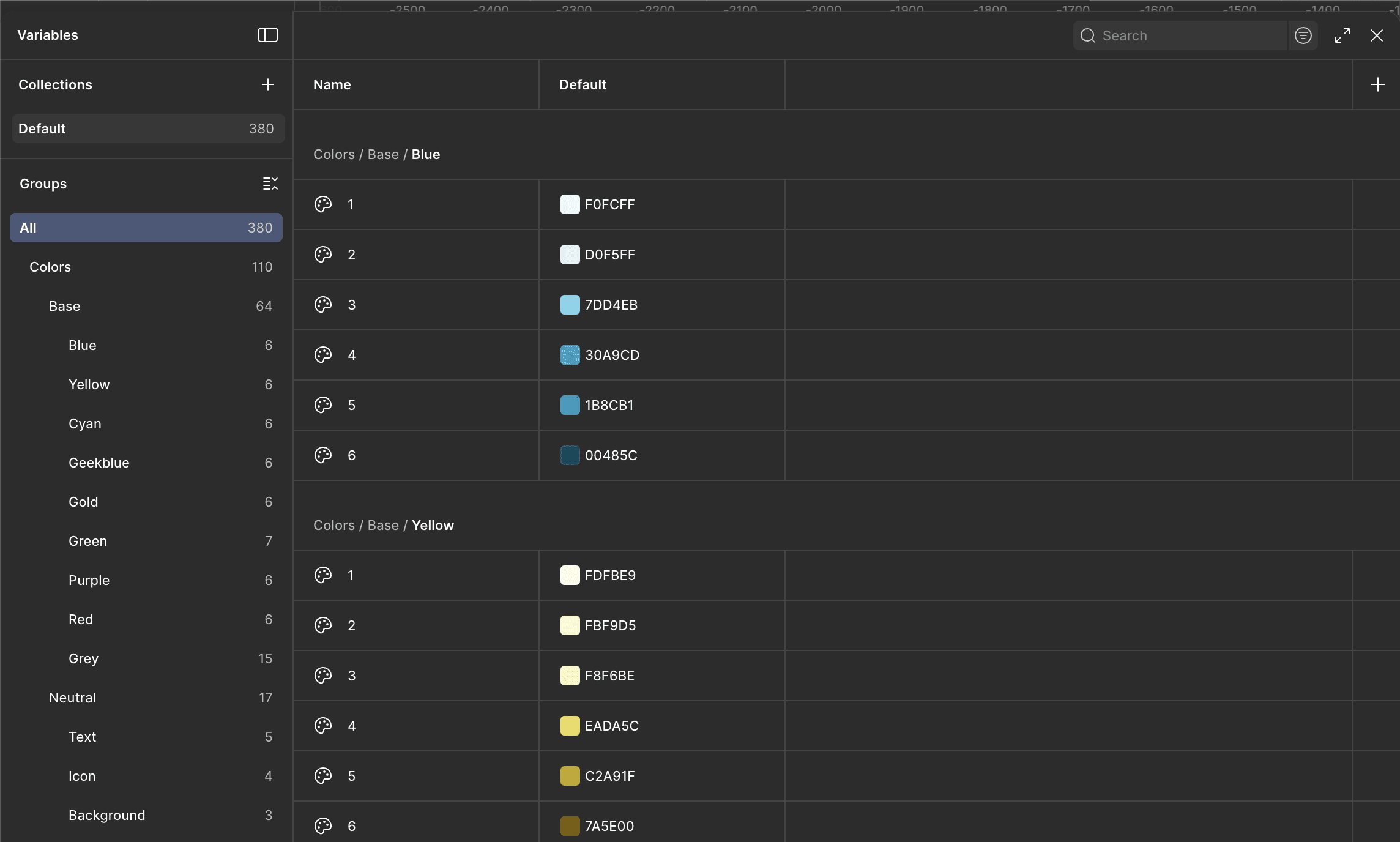
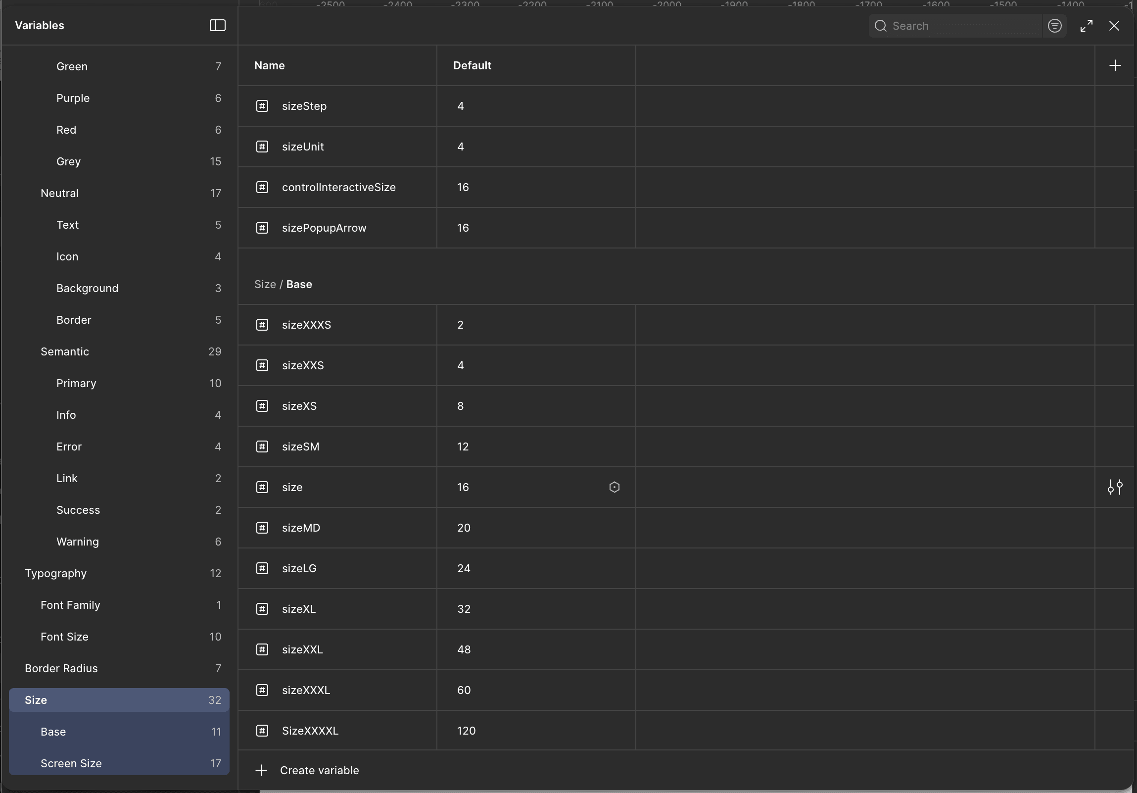
New foundation layer — accessible color system, type scale, spacing grid, and unified iconography.
03 — Components


Rebuilt 40+ components with clear specs, states, accessibility rules, and Angular props.”
With the foundations in place, I rebuilt the component library following Atomic Design principles, ensuring scalability, reusability, and long-term maintainability. I began with the smallest, most fundamental elements — atoms — and progressively built up to more sophisticated components and full interaction patterns.
At the atomic level, I redesigned core elements such as buttons, icons, text fields, toggles, chips, labels, and input states. Each atom was rebuilt using the new semantic tokens, ensuring consistent colors, spacing, typography roles, and interaction behaviors across every state, including focus, hover, active, and error. These atoms became the building blocks that developers could reliably assemble without visual drift or custom overrides.
Once the atoms were stable, I moved into molecules, combining these base elements into more functional components such as dropdowns, selects, date inputs, checkbox groups, and banner alerts. Each molecule included detailed specifications, accessibility rules, and Angular prop definitions. This layer introduced clear patterns for how components should behave when interacting with user input, validation, or system feedback.
Finally, I rebuilt the more complex organisms, such as modals, navigation headers, multi-step forms, and the platform’s table component. The table was one of the most significant improvements: WorkFlex previously had four completely different table implementations across the product. I consolidated all of them into a single, stable, and fully documented table organism with a unified logic layer, configurable columns, built-in filtering and sorting patterns, and consistent empty/error states.
Across all levels of the atomic hierarchy, each component was delivered with full specifications, interaction diagrams, accessibility guidelines, and code mapping to Angular. This systematic approach eliminated one-off builds, reduced regressions, and enabled engineering to ship features with far more consistency and speed.
04 — Governance & Documentation
Design System documentation hub: usage guidelines, component specs, tokens, QA checklists, and contribution process.


To ensure adoption and scalability, I built a complete documentation hub covering token usage, component anatomy, props and states, Do/Don’t guidance, accessibility requirements, migration steps, release notes, and a clear contribution model. This documentation unified design, engineering, and QA around the same standards.
An example of a code : Alert component before
<div class="alert-container">
<div class="image-container">
<img
ngSrc="./assets/img/triangle-exclamation-red.svg"
alt="Exclamation triangle"
height="20"
width="20"
/>
</div>
<div class="text-container min-days-alert-text">
<span i18n="@@exceedsBalance">Exceeding available balance</span>
</div>
</div>
Each usage required setting up its own CSS classes and icon asset.
High risk of visual inconsistencies and one-off variations.
Static markup duplicated in every place it’s needed.
An example of a code : Alert component After
<ds-alert-banner
preset="warning"
icon="warning"
message="Exceeding available balance."
i18n-message="@@exceedsBalance"
></ds-alert-banner>
Uses predefined presets and icon tokens to enforce consistency.
Styling, spacing, and behavior are centrally governed by the Design System, reducing custom CSS and one-off implementations.
Reusable Design System component with a single API.
Engineering Collaboration
The Design System was built in deep partnership with engineering. I worked daily with two engineering managers and the frontend team to integrate tokens into Angular, remove Tailwind conflicts, consolidate component logic, and align Storybook with Figma. We collaborated on state diagrams, edge-case handling, and regression-proof implementation patterns. Storybook became the source of truth for QA and code-level consistency, ensuring components looked and behaved identically across environments.

The impact
In the last year, I led the WorkFlex Design System, evolving it from no library with less than 0% alignment with code components to a state-of-the-art system. 100% design/code-aligned, design token-based, WCAG 2.1 AAA level accessible.
600
▲
Token created
100%
▲
UI built using system components
What I have learned
This initiative reinforced that tokens and governance are the true backbone of any design system. Components alone don’t create consistency — system thinking, partnerships with engineering, and clear processes do. A design system is not a design file; it’s organizational infrastructure. Adoption requires cultural change, not just beautiful components.
But, as importantly, the system enabled the first significant design language change in 3 years of WorkFlex a cross 7 languages,. bringing it closer to the premium design standard.
WorkFlex – Establishing single source of truth and reduce execution time by 40%
When I joined WorkFlex, I stepped into a platform that had grown quickly but without a unified design or front-end foundation. Every feature team had its own way of building components. The product relied on a mix of Tailwind and raw CSS overrides, multiple table implementations, three separate icon libraries, and custom components that looked and behaved differently across modules.
There were no tokens, no documentation, and no single source of truth. This inconsistency created regressions, slowed development, and weakened the overall product experience. My mandate as Principal Product Designer was clear: establish a unified Design System that would scale across engineering, reduce delivery time, and create a consistent, accessible experience across the WorkFlex platform.
SAAS
Design system
Timeline
2025
Platform:
Web + Mobile
Team
5 Engineers, Me
Platform:
Staff Product Designer
The goal
The goal of this initiative was to build the first unified, scalable Design System for WorkFlex in order to eliminate UI inconsistencies, reduce engineering effort, and enable the product to scale efficiently.
My Role
directed the vision, strategy, and roadmap for the entire Design System initiative. My responsibilities covered the full lifecycle: defining the token architecture, building foundations and components, aligning with two engineering managers and the frontend team, establishing governance, and driving adoption across the product organization. I also introduced systematic design practices to a company that had never worked with a mature design system before.
How it
was before
Before the Design System initiative, WorkFlex had no unified approach to alerts, toasts, notifications, or info bars. The image below shows how these components looked across different modules.
They were built independently by each developer, with no shared tokens, no consistent spacing, no color hierarchy, and no accessibility rules.
Notifications appeared in different sizes, positions, and color palettes. Some used shadows, others didn’t. Some followed Tailwind defaults, others were hardcoded inline. The same status type—success, error, info—could look completely different depending on the feature team that built it.
There were also semantic inconsistencies:
success green = 4 different greens
error red = 3 different reds
info blue = multiple shades with no contrast check
Additionally, layout patterns varied drastically: left-aligned, centered, vertical stacks, small versions, stripe versions, and multiple custom implementations. Because nothing was standardised, engineers re-created similar components repeatedly, causing regression issues, inconsistent accessibility, and slower delivery.
1. Third-Party Library Lock-In: The codebase relied heavily on two UI frameworks simultaneously, creating architectural complexity and long-term maintainability risks.
PrimeNG: 939 import statements across 306 components (~70% of the codebase)
Angular Material: 372 import statements across 180 components (~41% of the codebase)
Framework Overlap: 146 components (33%) imported both frameworks
2. Style Duplication Everywhere: Due to the absence of a centralized styling strategy, developers introduced ad-hoc SCSS overrides across the system.
.p-buttonOverrides: 67 occurrences across 28 SCSS filesViewEncapsulation.NoneUsage: 99 components using global style leakage to override librariesGlobal Theme Overrides: Nearly 2,000 lines of override styles
No components nor foundations before
Story of cleaning this mess
01 — Tokens
Architecture
Semantic and functional tokens exported as JSON and integrated into Angular theming
The first step was creating a token-first foundation. I built the complete color, spacing, type, border, radius, and shadow token system using Figma Variables. These tokens were then exported as JSON and integrated directly into Angular’s theming structure. Shifting to semantic and functional tokens created consistency, eliminated visual drift, and aligned design and engineering on a shared, scalable vocabulary.
Kinetic layers
Light and shadow are two important building blocks of reality and play a big role in the way we experience the world. The closer a layer is to the user, the lighter it gets. Layering is also a great way to convey hierarchy, clarifying the order of triggered events and other interface changes.
The first step was creating a token-first foundation. I built the complete color, spacing, type, border, radius, and shadow token system using Figma Variables. These tokens were then exported as JSON and integrated directly into Angular’s theming structure. Shifting to semantic and functional tokens created consistency, eliminated visual drift, and aligned design and engineering on a shared, scalable vocabulary.
02 — Foundations
I rebuilt the entire foundation layer from scratch. The platform moved from unpredictable Tailwind overrides and mismatched icons to a clean, accessible semantic color system, a unified typography scale, a structured spacing system, and a single icon library. Replacing three icon libraries with Material Symbols simplified performance, improved visual clarity, and made implementation more predictable for engineers.
New foundation layer — accessible color system, type scale, spacing grid, and unified iconography.
03 — Components
With the foundations in place, I rebuilt the component library following Atomic Design principles, ensuring scalability, reusability, and long-term maintainability. I began with the smallest, most fundamental elements — atoms — and progressively built up to more sophisticated components and full interaction patterns.
At the atomic level, I redesigned core elements such as buttons, icons, text fields, toggles, chips, labels, and input states. Each atom was rebuilt using the new semantic tokens, ensuring consistent colors, spacing, typography roles, and interaction behaviors across every state, including focus, hover, active, and error. These atoms became the building blocks that developers could reliably assemble without visual drift or custom overrides.
Once the atoms were stable, I moved into molecules, combining these base elements into more functional components such as dropdowns, selects, date inputs, checkbox groups, and banner alerts. Each molecule included detailed specifications, accessibility rules, and Angular prop definitions. This layer introduced clear patterns for how components should behave when interacting with user input, validation, or system feedback.
Finally, I rebuilt the more complex organisms, such as modals, navigation headers, multi-step forms, and the platform’s table component. The table was one of the most significant improvements: WorkFlex previously had four completely different table implementations across the product. I consolidated all of them into a single, stable, and fully documented table organism with a unified logic layer, configurable columns, built-in filtering and sorting patterns, and consistent empty/error states.
Across all levels of the atomic hierarchy, each component was delivered with full specifications, interaction diagrams, accessibility guidelines, and code mapping to Angular. This systematic approach eliminated one-
04 — Governance & Documentation
To ensure adoption and scalability, I built a complete documentation hub covering token usage, component anatomy, props and states, Do/Don’t guidance, accessibility requirements, migration steps, release notes, and a clear contribution model. This documentation unified design, engineering, and QA around the same standards.
An example of a code : Alert component before
<div class="alert-container">
<div class="image-container">
<img
ngSrc="./assets/img/triangle-exclamation-red.svg"
alt="Exclamation triangle"
height="20"
width="20"
/>
</div>
<div class="text-container min-days-alert-text">
<span i18n="@@exceedsBalance">Exceeding available balance</span>
</div>
</div>
Each usage required setting up its own CSS classes and icon asset.
High risk of visual inconsistencies and one-off variations.
Static markup duplicated in every place it’s needed.
An example of a code : Alert component After
<ds-alert-banner
preset="warning"
icon="warning"
message="Exceeding available balance."
i18n-message="@@exceedsBalance"
></ds-alert-banner>
Uses predefined presets and icon tokens to enforce consistency.
Styling, spacing, and behavior are centrally governed by the Design System, reducing custom CSS and one-off implementations.
Reusable Design System component with a single API.
Engineering Collaboration
The Design System was built in deep partnership with engineering. I worked daily with two engineering managers and the frontend team to integrate tokens into Angular, remove Tailwind conflicts, consolidate component logic, and align Storybook with Figma. We collaborated on state diagrams, edge-case handling, and regression-proof implementation patterns. Storybook became the source of truth for QA and code-level consistency, ensuring components looked and behaved identically across environments.
The impact
In the last year, I led the WorkFlex Design System, evolving it from no library with less than 0% alignment with code components to a state-of-the-art system. 100% design/code-aligned, design token-based, WCAG 2.1 AAA level accessible.
600
▲
Token created
100%
▲
UI built using system components
What I have learned
This initiative reinforced that tokens and governance are the true backbone of any design system. Components alone don’t create consistency — system thinking, partnerships with engineering, and clear processes do. A design system is not a design file; it’s organizational infrastructure. Adoption requires cultural change, not just beautiful components.
Let's Connect
Let's Grow Together
Feel free to hit me up, I am looking forward to hearing from you
Let's Connect
Let's Grow Together
Feel free to hit me up, I am looking
forward to hearing from you
Let's Connect